The presence of the interface. Visual control over all changes - you immediately see the
result!
Working in a regular Internet browser.
Flexible customization of the overall menu design (width, color, transparency, shadow,
borders, etc.)
Installing a logo that opens the site on a click.
Creating buttons (4 options by default).
Customize the design of both a group of buttons and individual options (width, height,
color,
transparency, shadow, borders, text, etc.).
Assigning an icon to buttons.
The ability to set the image in the button.
Creating an individual menu tree structure. Assign an opening to any button
groups of buttons, which in turn can also have groups.
Assigning preset actions to buttons (open panorama, photo, selected view,
youtube, website). You can also assign any action to a button click by writing
the corresponding code.
Enter text in four languages.
The project settings and all buttons (in the form of layers) are saved in an xml file.
The ability to save design presets for use in subsequent ones projects.
There is a wide opportunity to edit the code of layers and menu styles.
Work with the plugin in an internet browser! The plugin will not work in krpano
tools!
-
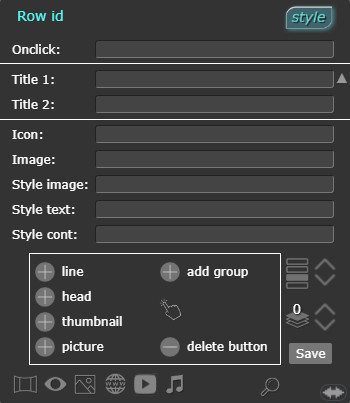
open the design editor panel.
"Onclick:" - the code is output to this line, executed when you
click on
the button. You can add your own or change this code.
"Title 1:" - the text of the button is displayed in this line.
Enter in the line
custom button text (by default, the name of the layer of the button being created is
displayed).
"Title 2: - Title 5:" - enter the text in other languages, it will
be
switch when the language change button is pressed.
"Icon:" - Click on "Icon:" - a window will open. Select
the icon in the folder "menu/image/icon/" . It will be installed before the text in the button. The line will contain
the full path to the icon, you can enter your own path. You must first place the icons in this folder
"Image:" - Click on "Image:" - a window will open.
Select the thumbnail image in the folder "menu/image/Thumbnails/" . It will be installed in the button,
filling the width by 100%. You must first place the thumbnail images in this folder.
"Style image:" - name of the image layer style. You can
set your own image style.
"Style text:" - name of the text layer style. You can install
your own text style.
"Style cont:" - name of the button container layer style. You can
set your own style.
line - creates a button with a preset design of the button container and
text.
head - creates a button with a preset design of the button and
text container. Unlike the first one, the font of the text is higher and larger.
thumbnail - creates a thumbnail button. The text of the button is located at
the bottom and
changes the background when you hover the cursor. Clicking on it opens a list of thumbnails of
panoramas. Select from the list
a panorama, by clicking on it. The icon and the name of the panorama will be set to the button.
picture - By default, the button is set to crop the image on mouse
hover "crop".
For example, using "crop",
by default, the lower half of the image will be shown, and when you hover over the button, the upper
half will be displayed.
To assign any actions to a button (opening a group of buttons, changing the design of the
button)
it must be activated by clicking on it.
add
group - activate the button that you want to assign the opening of the group to. Create a group
by clicking on
"add group". The block with the buttons will move to the left and a clean window will appear. Here you
can create buttons
the current group. You can also assign the opening of groups to the buttons inside the group. Thus, you
can
make a tree-like menu structure with many attachments.
- Block
button actions. If you are editing buttons, this will make it easier to activate the button for editing.
delete
button - delete the active button. If there is a nested group, it is also deleted.
- Move
the button one position up/down. The indicator shows the position number of the active button.
- If the
buttons overlap each other, then you can set the overlap order. The indicator shows the visibility layer
number of the active button.
Activate the button and assign an action: -
Select a scene from the list that opens. If the button is "thumbnail", it will automatically be assigned
a scene thumbnail and thumbnail caption text, and will be assigned to open the selected scene. Other buttons will be assigned to open the selected scene and caption.
-
select a scene, set the desired view and viewing angle. The menu button will open this view.
-
Click and select an image in the window that opens. It should be located at
"menu/image/". The button will open this image.
- click -
a line will appear for entering the site address, which will open in the frame when you click
menu buttons. Attention!!! Not all sites allow you to open during
frame! Use links without symbols like "&", an error will be generated!
-
click - a line opens for entering the code youtube. You do not need to enter the entire link to the
video УouTube.
Example: "https://www.youtube.com/watch?v=hUDioIQdDGs"
You need to copy and paste only this piece into the line - "hUDioIQdDGs"
-
click and select the audio file in the window that opens. It should be placed at the path
"menu/sound/". The audio panel will appear. The button will start the audio
sound.
Attention!!! You need to connect the plugin krpano soundinterface.
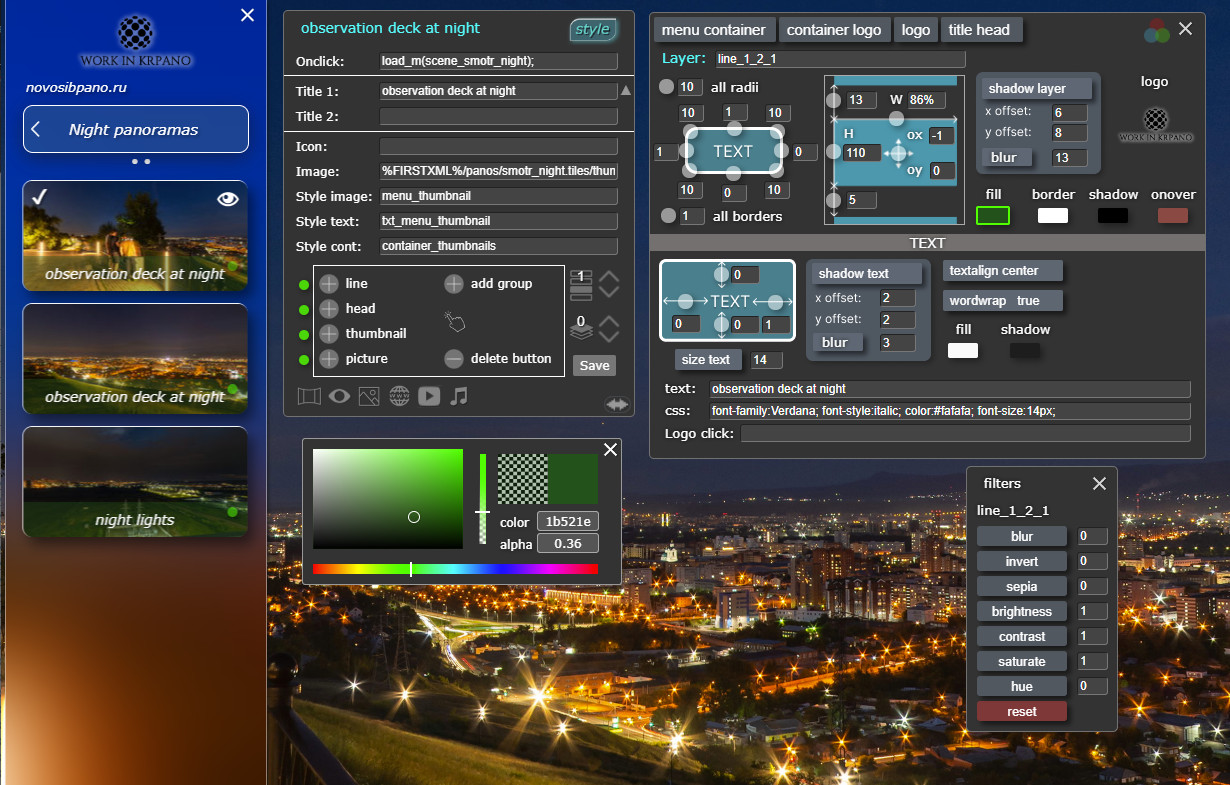
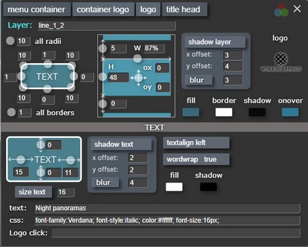
Click on the button "style", a window opens for editing the menu design.
At the top there are buttons that select the element to edit.
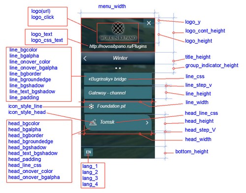
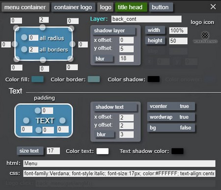
Changeable parameters: Container:
Changing the thickness of the border individually or simultaneously all 4 sides (pixels).
Changing the rounding of corners individually or all at the same time (pixels).
Shadow offset along the x and y axes (pixels).
Blurring the shadow.
Width change (pixels/%).
Height change (pixels/%).
X-axis offset (pixels).
Y-axis offset (pixels).
Distance between buttons (pixels).
Changing the fill color and transparency.
Changing the color and transparency of the fill when hovering the cursor.
Changing the color and transparency of the border.
Changing the color and transparency of the shadow.
Selecting a logo image from the explorer that opens.
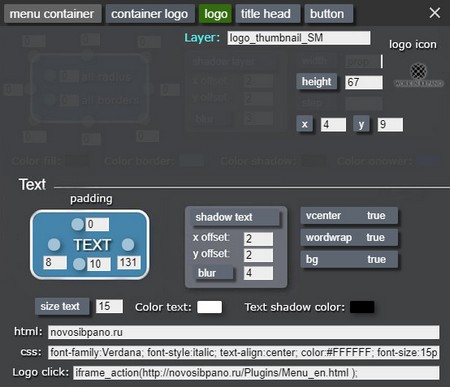
Text:
Changing the text indentation from 4 sides (pixels).
Offset of the text shadow along the x and y axes (pixels).
Blurring the text shadow.
Vcentr - vertical position of the text in the center (true/false).
Changing the font size.
Changing the text color.
Changing the color and transparency of the text shadow.
Ability to insert parameters css.
Entering the logo text.
To change the parameter, click on the corresponding button and, without releasing it, move the
cursor to the left or
right.
You can enter the value from the keyboard in the window next to the button.
Depending on the selected item for editing, unnecessary tools in the panel are darkened.
The button is active by default "Menu contayner" (green color).
menu contayner
Main container, in which all the menu items are located.
contayner logo
The logo container is located at the top of the menu.
It contains the image of the logo and the signature of the logo.
logo
Click on the logo thumbnail, a window will open. Select the logo image.
The logo must be in the plugin folder menu/image.
The following can be configured:
logo width
x and y offset inside its container.
Configure the logo text. The "Text" tab has active tools for editing text.
title head
Customize the menu title and its text.
You can change the title title (starting position). The currently enabled language is taken into
account.
Switch to another language and enter a name in it.
Activate the menu button by clicking on it (if the button opens a group nested in it (click), then
press and without releasing move the cursor to the side and release (click). Then there will be no
transition to the
group).
The type of this button will be displayed in the editor at the top. Configure the button parameters,
the changes will be made immediately
visible on the selected button.
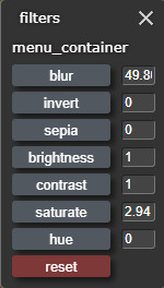
This is a new krpano tool for creating filters backgrounds, allowing you to create interesting and modern designs.
It can be applied to buttons individually or to a menu container.
Select the element to edit (button, container, etc.).
Click on the button in the design settings panel, the filter panel will open.
The name of the edited layer is displayed at the top.
To change the parameter, click on the button and drag the mouse while it is pressed, or enter the parameter in the box opposite the button.
By default, you can create 4 types of buttons. Each type is combined into one group.
When you open the design editing panel, green indicators (dots) will appear on the buttons.
-
There is a translucent red circle around the indicator - the button is active for editing.
Opposite the buttons for creating menu buttons there are green indicators. They are clickable and switch -
edit all buttons of this type simultaneously or separately.
-
The green indicator on the button, changes to the active button are applied to all buttons of this
button at the same time
groups. The changes are saved and will be applied to the newly created buttons.
-
Yellow indicator on the button - all buttons of this group are ungrouped and edited by
separately.
When you re-enable grouping, the change in the active button of a specific parameter
apply to all buttons.
For example: you have ungrouped the buttons and set different colors on them. Then grouped it again
and
they began to change the thickness of the curb. The border thickness will change for all buttons,
but the color of the buttons will not will chang.
Clicking on the indicator in the button switches its state. -
Red. The button is completely blocked from editing in the group and is edited individually.
В файл menu/saved_settings.xml находятся основные настройки элементов меню(параметры контейнера меню, стили кнопок) а так же созданные слои кнопок. При изменении параметров меню и сохранении значения перезаписываются в файл saved_settings.xml
The menu/saved_settings.xml file contains the main settings of the menu elements (menu container parameters, button styles) as well as the created button layers. When changing the menu parameters and saving, the values are overwritten in the saved_settings.xml file
title_onover_color - (0x0F379D) container fill color when
hovering over the mouse.
title_picture -
(%CURRENTXML%/image/test.png) path to the button image. If not filled, the container fill is used. You can change additional settings for the container with the title in the file
"style_menu.xml" - style "cont_title".
list_window - if enabled, then the plugin window with thumbnails of icons (photos) for selection is displayed, otherwise the explorer window will open.
interactive - if enabled, then the menu will automatically show a thumbnail (button) of the active panorama.
backup - (true/false) If set to "true", then when saving a project, the name for saving the backup file in the format "saved_settings.xml - will be displayed first. backup-2021.11.09-20.51.42.xml" and then "saved_settings.xml"
closeClickBg
- close the image when clicking on the background (true/false). closeClickPhoto
- close the image when clicking on the image (true/false). bgalpha
- background transparency (0-1). bgcolor
- background color(0x000000). bgborder
- thickness, color, transparency of the border (10 0xFFFFFF 1). bgshadow
- shadow offset along the x, y axes, blur, color, shadow transparency (7 7 20 0x000000
0.5). bgroundedge
- rounding corners (5 5 5 5). textBgAlpha
- transparency of the background under the caption text (5 5 5 5). textBgcolor
- background color under the caption text (0x000000). css
- signature text style (font-family:Comic Sans MS, Comic Sans, cursive, Arial; color:#FFFFFF;
font-size:20px; text-align:center). blur
- background blur in pixels (0...).
If you have new license krpano,
then you can use the plugin to blur the background of the image.
Blur.Make sure that the file
"pp_blur.js" located in the folder "plugins".
Uncomment it plugin id="pp_blur" in the file layer_menu.xml, so that the
background behind the frame is blurred. height_photo
- the height of the image relative to the height of the viewport in % (0 - 100).
You can use these actions to assign them to menu buttons or any other actions.
lang_set (1); - enter a number between 1 and 3 in parentheses to enable the
appropriate language (title_1...title_3).
openFrame (iframe, https://krpano.com, 1200, 900, true); - open a website
(krpano.com) in the frame, the maximum width is 1200px, the maximum height is 900px, and
scrolling is enabled (true). A
source Attention! Not all sites allow you to open in a frame!
openYout (hUDioIQdDGs); - open youtub in the frame, you do not need to enter the
entire link to the youtube video.
Example:"https://www.youtube.com/watch?v=hUDioIQdDGs"
you only need to copy and paste this part into brackets - "hUDioIQdDGs"
If you have new license krpano,
uncomment plugin name="pp_blur" in the file layer_menu.xml so that
the background behind the frame is blurred.
shou_m(); - open the menu.
hide_m(); - close the menu.
search_button_menu(search in text, button layer name); - Go to menu button.
Assigning a transition action to a menu button. search in text - enter the text or part of the text contained on the menu button, when called, it will go to the first button containing this text. Example:search_button_menu('room', false); button layer name - enter the name of the button layer, when called it will go to this button. Example: search_button_menu(false, line_1_4_2);
You can customize the search bar design in the file layer_menu.xml layer "cont_search_menu" and "searh_menu"
text input line searh.js
Download the DEMO tour, there is a plugin menu. You can plug it into your tour and test it. To do
this, use the file "list_menu.xml" from the folder "new project".
The demo version is fully working and differs from the full one by the presence of the inscription
"Menu demo version".
You can purchase the plugin by paying by the methods indicated below.
The archive for download will be sent within 24 hours after payment is received.
You will receive plug-in updates for free!
To purchase a plugin "Menu + editor" for 51 EUR.
Pay-Pal payment
Send your Pay-Pal address to novosibpano@yandex.ru and write the name of the plugin,
I will send you an invoice for payment via Pay-Pal.
If you have a PayPal account, send me the address, I will issue an invoice via PayPal.
Added menu search. When entering text or part of the text contained on the button, there will be a transition to this button
Added an action for transition to menu buttons. It is possible to transition by the content of the text in the button or by the name of the button layer.
Almost completely changed the logic of the menu code.
Changed the menu design editing panel, control is more visual and convenient.
Now the menu has an interactive - if there is a transition to another panorama not through the menu (by arrows, by buttons, etc.), then the menu will automatically show a thumbnail or button corresponding to the displayed panorama.
Added a tab for setting background filters , such as blur, saturation, etc.
To select images, icons, audio files, a window with thumbnails (list) from the corresponding folder opens, no need to open Explorer and specify the path.
Due to large changes in krpano v1.21, the previous version of the menu does not work with krpano v1.21.
Basically this version is an adaptation for krpano v1.21.
In this version, the executing code has been radically changed and the plugin
saves the already created layers of menu buttons, and not their description,
according to which the buttons were created dynamically before.
The editor immediately creates menu buttons.
Ability to edit a group of buttons.
When editing, the changes are immediately applied to all the buttons and you
visually control the process.
The saving of buttons in the form of layers gives a wide opportunity to edit the
button code.
The ability to set a delay for loading the menu, what can have a positive impact
on the speed of the tour launch.
Added a change in the width of the top button (header).
Added a change in the transparency of the button when hovering the mouse.
Added the button name input in the 3rd language in the panel.
All buttons can have attachments.
Added an audio panel with a slider display and time, sound volume.
Removed the audio connection from layer_menu.xml - if the sound plugin is
registered more than once, the tour will not start.
The menu is opened (if set) at the end of the menu creation cycle.
Added the menu_sm function. download_delay= "2" - the delay in creating menu
buttons at startup is set. When starting a tour, simultaneous loading of the
panorama and the menu gives a delay in loading the tour (brakes). If you load
the menu a little later, the tour starts faster and smoother.
The menu can be opened only after all the buttons are created.
Plugin is provided "As Is" without warranty of any kind, either express or implied, including
any
warranty of quality, merchantability, or fitness for a particular purpose. In no event will
author of plugin be liable for loss of data,
costs of procurement of substitute goods or services or any special, consequential or incidental
damages, under any cause of action and regardless
of whether or not plugin author have been advised of possibility of such damage. This limitation
will apply notwithstanding any failure
of essential purpose of any limited remedy provided herein. In any event plugin author will have
no liability arising out of this agreement.


 -
open the design editor panel.
-
open the design editor panel. line - creates a button with a preset design of the button container and
text.
line - creates a button with a preset design of the button container and
text. by default, the lower half of the image will be shown, and when you hover over the button, the upper
half will be displayed.
by default, the lower half of the image will be shown, and when you hover over the button, the upper
half will be displayed.
 - Block
button actions. If you are editing buttons, this will make it easier to activate the button for editing.
- Block
button actions. If you are editing buttons, this will make it easier to activate the button for editing.
 delete
button - delete the active button. If there is a nested group, it is also deleted.
delete
button - delete the active button. If there is a nested group, it is also deleted.  - Move
the button one position up/down. The indicator shows the position number of the active button.
- Move
the button one position up/down. The indicator shows the position number of the active button.  - If the
buttons overlap each other, then you can set the overlap order. The indicator shows the visibility layer
number of the active button.
- If the
buttons overlap each other, then you can set the overlap order. The indicator shows the visibility layer
number of the active button.  - Disable/enable search in menu.
  -
Select a scene from the list that opens. If the button is "thumbnail", it will automatically be assigned
a scene thumbnail and thumbnail caption text, and will be assigned to open the selected scene. Other buttons will be assigned to open the selected scene and caption.
-
Select a scene from the list that opens. If the button is "thumbnail", it will automatically be assigned
a scene thumbnail and thumbnail caption text, and will be assigned to open the selected scene. Other buttons will be assigned to open the selected scene and caption.  -
select a scene, set the desired view and viewing angle. The menu button will open this view.
-
select a scene, set the desired view and viewing angle. The menu button will open this view.
 -
Click and select an image in the window that opens. It should be located at
"menu/image/". The button will open this image.
-
Click and select an image in the window that opens. It should be located at
"menu/image/". The button will open this image. - click -
a line will appear for entering the site address, which will open in the frame when you click
menu buttons.
- click -
a line will appear for entering the site address, which will open in the frame when you click
menu buttons.  -
click - a line opens for entering the code youtube. You do not need to enter the entire link to the
video УouTube.
Example: "https://www.youtube.com/watch?v=hUDioIQdDGs"
-
click - a line opens for entering the code youtube. You do not need to enter the entire link to the
video УouTube.
Example: "https://www.youtube.com/watch?v=hUDioIQdDGs" -
click and select the audio file in the window that opens. It should be placed at the path
"menu/sound/". The audio panel will appear. The button will start the audio
sound.
-
click and select the audio file in the window that opens. It should be placed at the path
"menu/sound/". The audio panel will appear. The button will start the audio
sound.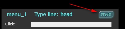 Click on the button "style", a window opens for editing the menu design.
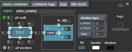
 in the design settings panel, the filter panel will open.
 -
There is a translucent red circle around the indicator - the button is active for editing.
-
There is a translucent red circle around the indicator - the button is active for editing.  -
The green indicator on the button, changes to the active button are applied to all buttons of this
button at the same time
groups.
-
The green indicator on the button, changes to the active button are applied to all buttons of this
button at the same time
groups. -
Yellow indicator on the button - all buttons of this group are ungrouped and edited by
separately.
-
Yellow indicator on the button - all buttons of this group are ungrouped and edited by
separately. -
Red. The button is completely blocked from editing in the group and is edited individually.
-
Red. The button is completely blocked from editing in the group and is edited individually.